Better Real-Time Maps Coming Soon to All Nine Muni Metro Stations
 New map software at Castro station. New real-time maps, already being tested in several stations, will soon be up in all nine Muni Metro stations. Photo: Michael Rhodes
It's a familiar scene for many Muni riders: standing in a huge crowd on a Muni Metro station platform, scrutinizing the archaic-looking map on the mounted LCD, hoping for a two-car LL or a one-car J. Since those displays first went up at Embarcadero station in the late 1990s, and the other eight stations in 2007, they've given waiting customers something to ponder while waiting for a particularly tardy train, but have been far too cryptic to reach their full potential in keeping riders informed. Within the next few months, however, displays in all nine Muni Metro stations will switch over to a much more legible map.
The new, more helpful map software is already in use on some displays at Embarcadero, Van Ness, and West Portal stations, said MTA spokesperson Judson True. One was also recently installed at Castro station. It was first piloted in May 2008, and from a design standpoint, True said it's been getting praise from some riders. The MTA commissioned the new Flash-based map software from NextBus, which the agency contracts with to provide NextMuni real-time arrival data.
Muni received complaints initially about the accuracy of the data on the new maps. NextBus data isn't available because GPS doesn't work in the tunnels, and Advanced Train Control System (ATCS) train location data can't smoothly be transferred to the NextMuni system until an upgrade to a key component of the ATCS is completed, which will take three years.
The old maps don't have this challenge because they're taken from
screenshots of the ATCS software, which was designed for operators,
not the general public. The MTA has been working to tweak and patch the
data on the new maps in the meantime, however, and True said the agency
now receives few complaints about their accuracy.
 The old ATCS-based map, still in use at most stations. Flickr photo: bradlauster
In addition to having a more readable map, the updated display software shows a table of arrival times for each line, something the ATCS screenshots lacked. "People seem to like it," said True. "They like the prediction table as part of the map, for example, as opposed to just a map."
Though the new maps are undoubtedly a leap forward from the old ones, a city with as much design and computer science talent as San Francisco will undoubtedly produce some incisive critiques and suggestions. The MTA is "always open to suggestions, absolutely," said True, as long as they're "advisable," and funding is available.
 The new map software at Castro station. Photo: Michael Rhodes
Of course, with independently-designed tools like the $4 iPhone application Routesy popping up and making life a little easier for Muni riders, it's hard not to wonder what the next generation of in-station map software could look like if Muni were to open up the process to any software developer interested in giving it a try.
Have you seen the new map software at other Muni Metro stations? Is the arrival time data on the new maps reliable, or still on the fritz? Still spotting the Blue Screen of Death pop up on the LCDs? Let us know what you're seeing in the comments section below.
Stay in touch
Sign up for our free newsletter
More from Streetsblog San Francisco
Commentary: There is Zero Ambiguity to the West Portal Tragedy
What happened in West Portal was entirely predictable and preventable. The city must now close Ulloa to through traffic and make sure it can never happen again
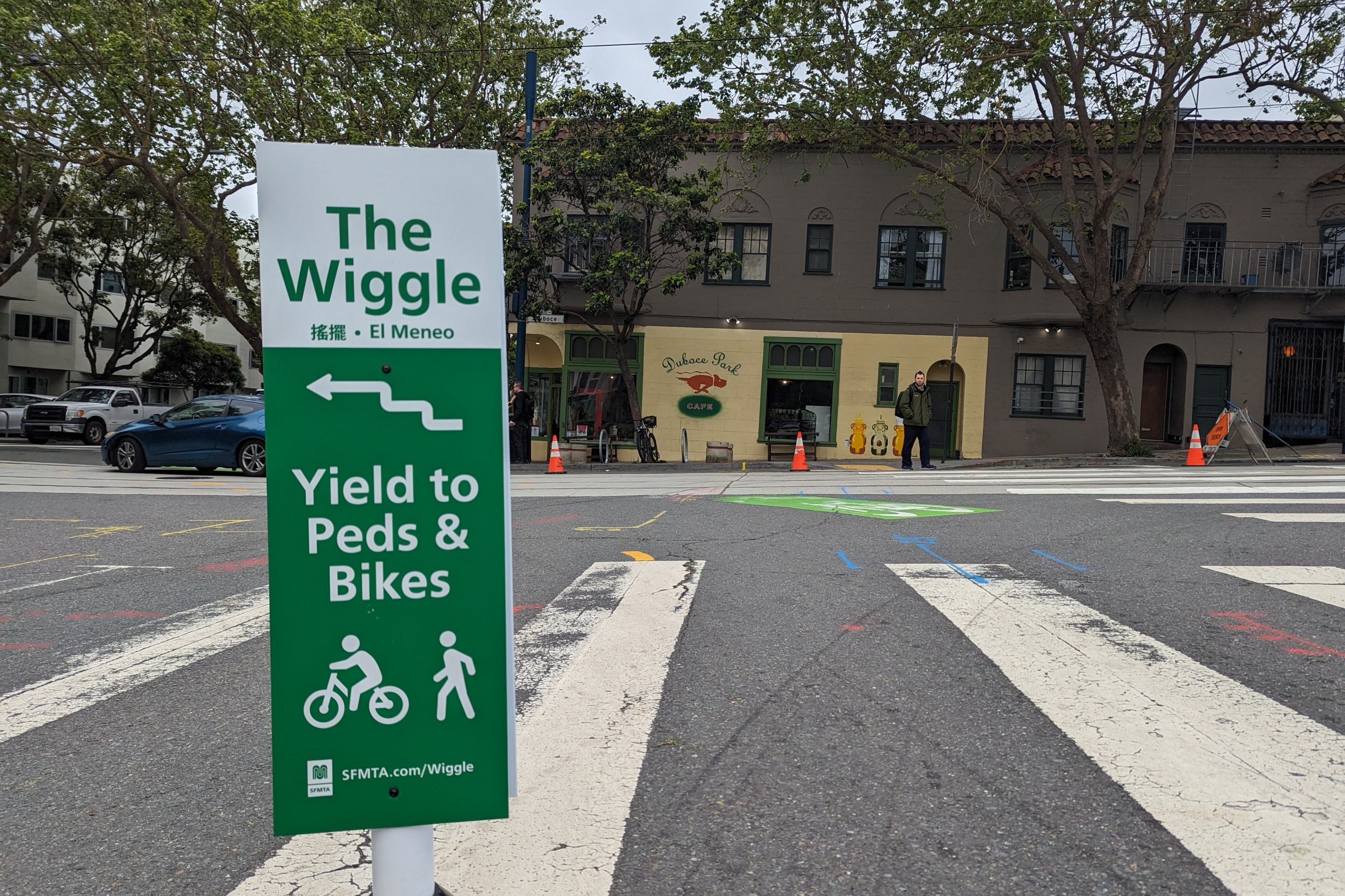
Independent Safety Advocates Beef up the Wiggle
Signs and soft-hit posts installed by advocates make the Wiggle bike route calmer and safer for cyclists and pedestrians