
Muni to Launch a New, More Legible Map

Tired of looking at Muni’s cluttered map? Good news: The SFMTA plans to roll out a new, more legible map of the Muni system.
The map was drafted over ten years, in the spare time of cartographers David Wiggins and Jay Primus, who also manages SFpark for the SFMTA. The two are donating their work.
“It’s really a labor of love for them,” Julie Kirschbaum, Muni’s operations planning and scheduling manager, told the SFMTA Board of Directors today. Kirschbaum said the map will show up on Muni shelters and on printed maps, as part of a larger branding effort called Muni Forward.
The map “helps visualize the service hierarchy,” said Kirschbaum. “Customers can see where there’s more service, and where there’s less service.”
The map uses more “sophisticated cartography techniques” to convey more information in a cleaner way, Kirschbaum said. Different colors, thickness of lines, and text sizes differentiate between characteristics like route frequency, rail lines, limited-stop, and express bus services. The names of transit-heavy streets appear larger than minor streets, and the text uses a more legible “title case,” instead of all capital letters. The map also uses symbols to mark major institutions, like schools and libraries.
Conveying the difference between faster Muni routes and local transit service “is a really important thing to communicate when we’re trying to drive people to our premium routes,” said Kirschbaum.
The map isn’t finalized yet, and will continue to be reshaped as Muni makes route changes and speed upgrades as part of the Muni Transit Effectiveness Project. So far, the SFMTA has only publicly released the snapshot shown above, which includes the Western Addition, Cole Valley, the Castro, NoPa, and the Upper and Lower Haight.
Kirschbaum said that Muni is also considering changing its route names, so that they more accurately reflect the streets they serve. As an example, she noted that the 6-Parnassus could be re-named the 6-Haight/Parnassus, to let tourists know that they can use the lesser-used trolley bus line to reach the world-famous destination of Haight-Ashbury.
For the hand-held version of the map sold in stores, Kirschbaum said the SFMTA is also developing a similar bike network map to be printed on the opposite side.
A requirement in the map contract says that the SFMTA must install the newly designed Muni map on at least 75 percent of its transit shelters by May 1, 2015.

More from Streetsblog San Francisco
Friday Video: A Master List of All The Reasons Why Car Domination Sucks

Buffy Wicks Pushes Legislation to Cut Red Tape for Transformational Bicycle and Pedestrian Projects
AB 1976 would impact a lot of projects including pedestrian malls, neighborhood greenways, safe routes to schools projects, and more.
The post Buffy Wicks Pushes Legislation to Cut Red Tape for Transformational Bicycle and Pedestrian Projects appeared first on Streetsblog California.

Weekend Roundup: Regional Transit Measure Update, More Art at Sunset Dunes…
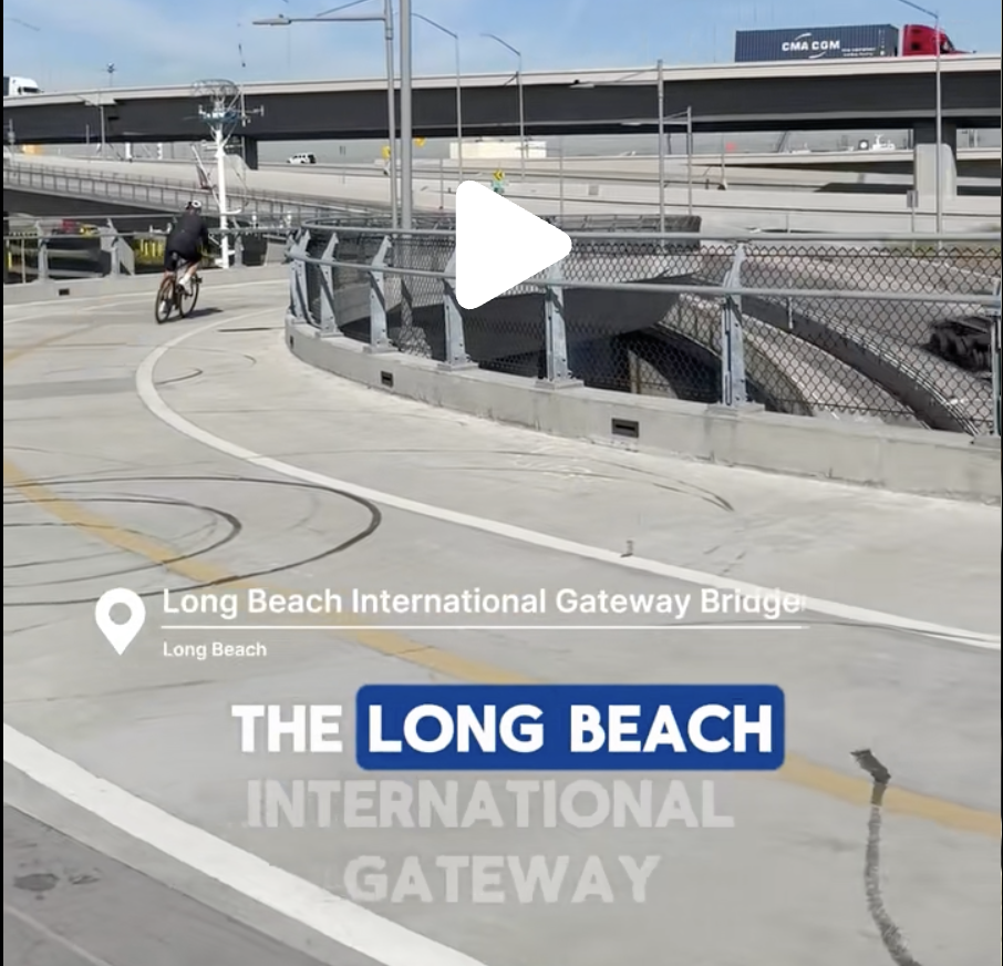
The Week in Short Videos
Back to Long Beach and the feds. want more fracking in the Central Valley.
The post The Week in Short Videos appeared first on Streetsblog California.
Comments Are Temporarily Disabled
Streetsblog is in the process of migrating our commenting system. During this transition, commenting is temporarily unavailable.
Once the migration is complete, you will be able to log back in and will have full access to your comment history. We appreciate your patience and look forward to having you back in the conversation soon.