Feast Your Eyes on Beautiful Trip Data From Year-Old Bay Area Bike Share
Bay Area Bike Share fans created some pretty dazzling images and videos to visualize the system's first six months of data, showing how this transportation system connects commuters' dots in SF and four other cities down the Peninsula. BABS' first birthday is approaching on August 29, and while the system isn't growing as fast as many would like, it has certainly matured into a normal part of downtown streets. The system has seen over 250,000 trips so far, most of them in SF.
The visualizations were submitted for an "Open Data Challenge" contest sponsored by the Metropolitan Transportation Commission, which has taken over BABS management from the Bay Area Air Quality Management District. From the MTC website:
In March, Bay Area Bike Share released a large, detailed set of anonymous data collected since the launch of the pilot program in August 2013. Users were invited to take the data, which included trip times, locations and bike numbers, among other information, and present it in a visually compelling manner. What resulted were 35 innovative and interactive entries. Five winners were awarded for best overall visualization, best presentation, best analysis, best data exploration tool and best data narrative.
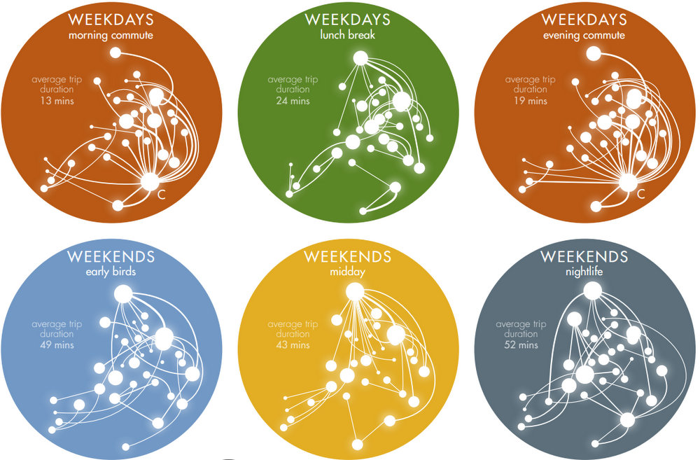
One of the most informative and mesmerizing creations came from Bjorn Vermeersch. He won the "Best Data Narrative" award by painting bike-share trip patterns in various patterns: as a solar system, constellations, and inkblot patterns which resemble things like birds.
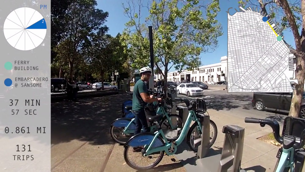
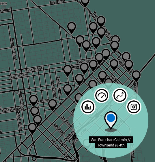
The data themselves aren't too surprising. Bike-share users heavily use stations traveling to and from Caltrain stations, and between various points within the station areas during lunchtime. The visuals show how stations fill up and empty out at different rates, depending on factors like the time of day and year. The "Best Overall Visualization" winner, Virot Ta Chiraphadhanakul, created an interactive map that displays trip patterns between any two stations.
These data should help inform the planned BABS expansion into the East Bay and beyond (the North Bay is a-knockin'). By now, it's pretty clear clear that bike-share is a vital link between transit, jobs, and everywhere else, and needs to expand throughout the region.
One other takeaway, one year on, is that Bay Area Bike Share has been embraced without much hue and cry -- bike-share is not so widely embraced by everyone in New York City.
Check out all of the winning data visualizations on the BABS website.
Read More:
Stay in touch
Sign up for our free newsletter