Mapping San Francisco’s Most Speeding-Plagued Streets
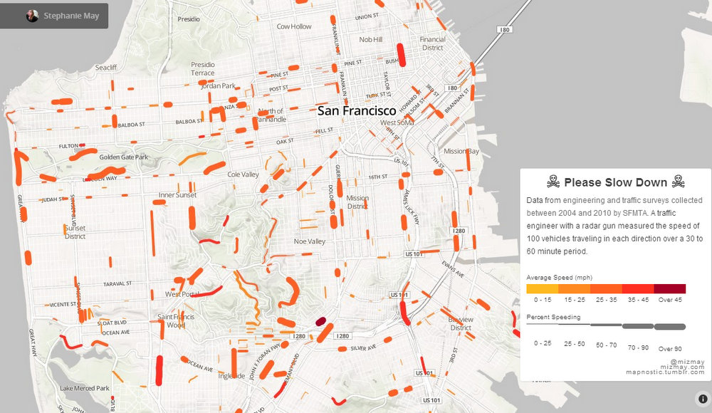
A new online map begins to show which San Francisco streets have the worst speeding problems, according to data from SFMTA engineering and traffic surveys. The map was created by Stephanie May, who works for the SF-based organization Urban Mapping and teaches cartography at SF State University and history at Stanford, according to her Twitter page.
Ideally, a map like this could show people where they should advocate for safety improvements, and where city agencies ought to focus enforcement and traffic calming efforts. This map is a start, but the available data has a lot of gaps, since speed surveys are typically done only in response to complaints from residents, May said. The data is also a bit dated, collected between 2004 and 2010. It would be interesting to see how road diets and other traffic calming measures implemented since then have changed the picture.
On Twitter, May said she thinks “the real message of the map is that @sfgov needs to monitor traffic speeds more systematically (and report).”

Read More:
Streetsblog has migrated to a new comment system. New commenters can register directly in the comments section of any article. Returning commenters: your previous comments and display name have been preserved, but you'll need to reclaim your account by clicking "Forgot your password?" on the sign-in form, entering your email, and following the verification link to set a new password — this is required because passwords could not be carried over during the migration. For questions, contact tips@streetsblog.org.