What other intersections would benefit from artistic Complete Streets makeovers?
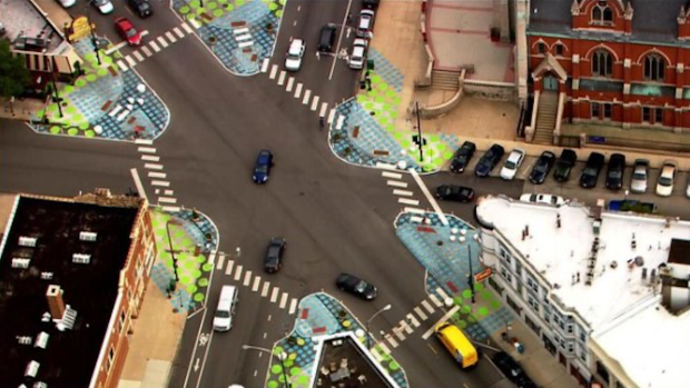


Turning excess road asphalt into pedestrian space can be done fairly cheaply and quickly with paint and posts, as the Chicago Department of Transportation recently showed at a couple dozen downtown intersections. It’s an easy way to create sidewalk bump-outs to shorten pedestrian crossing distances, and widen the turning radii of intersections to discourage drivers from whipping around them at dangerous speeds. Pedestrian islands can also be created this way.
Granted, the beige paint doesn’t have a lot of visual pizzaz. But Complete Streets interventions don’t have to be boring. There have already been few installations in Chicago that turned car space into people space that include interesting, artistic, or even political street paintings. For example, here are some colorful bumpouts CDOT recently installed in the Austin community as part of the Vision Zero West Side program
Earlier this fall a block of Lincoln Avenue at Leland in Lincoln Square, which was essentially a city-owned parking lot, was transformed into a new pedestrian plaza with a street mural by artist (and former bike messenger) Andrea Jablonski.
And the block of Catalpa Avenue between Clark Street and Ashland Avenue in Andersonville was temporarily pedestrianized this fall in conjunction with a new “Black Trans Lives Matter” street mural.
Yesterday Street Smarts Design + Build tweeted out a beautiful example of an artistic intersection makeover from Kansas City, Missouri. The paint-and-post intervention sharpened the corners of the junction to deter fast turns by drivers, and cut the crossing distances by about half.
It’s amazing that creating safer road conditions can be so much fun! pic.twitter.com/laQuIZHGdx
— Street Smarts Design + Build (@StreetSmartsDB) December 8, 2020
Today Streetsblog Chicago retweeted the images, asking our readers “Where in your neighborhood should this be done?” Chicagoans had a lot of thoughts. Here are some of the suggestions.
- Irving/Milwaukee/Cicero (“Six Corners”) in Portage Park
- Armitage/Ashland/Elston in Logan Square
- Belmont between Sheridan and Lake Shore Drive in Lakeview
- Every intersection on Addison between Kimball (3400 W.) and the Kennedy (3600 W.) on the border of Irving Park and Avondale
- “Every stop sign should be replaced with a roundabout and a cute mural in the center”
- Leavitt/Archer (near 36th) in McKinley Park
- Wilson/Broadway in Uptown
- Irving Park/Ashland in Lakeview
- Irving Park/Lincoln/Damen in North Center
- Howard/Greenview/Rogers in Rogers Park
- Logan/Kedzie/Milwaukee traffic circle in Logan Square (a redesign is already in the works)
- Bryn Mawr/Broadway/Ridge in Edgewater
- Belmont/Ashland/Lincoln in Lakeview (this junction already has some basic paint-and-post bump-outs)
- Devon/Sheridan/Broadway on the border of Edgewater and Rogers Park
- “LITERALLY EVERYWHERE”
Granted, not everyone is a fan of these kinds of interventions.
nowhere. they did it to lincoln-wellington-southport and it is now a nightmare https://t.co/WdxaafZ6kP
—
Adam Shane
(@Echo_Seven_E7) December 10, 2020
But in reality, that polkadot-decorated decorated six-way in Lakeview, shown at the top of this article, is a best practice. Sure, some drivers loudly complained when paint-and-post bulb-outs were installed in 2015 to shorten crossing distances and create new seating areas, forcing motorists to alter their driving habits a bit. But as videos from that era show, the makeover didn’t actually cause any major problems at rush hours. And after five years, and a minor design tweak or two, later, locals are used to the layout, so it’s even safer to walk, bike, and drive there, and most people probably just take that for granted.
The moral of the story is that these kinds of Complete Streets interventions are fairly easy and inexpensive, and can help make neighborhoods safer as well as more beautiful. So they really should be ubiquitous.
Read More:
More from Streetsblog San Francisco
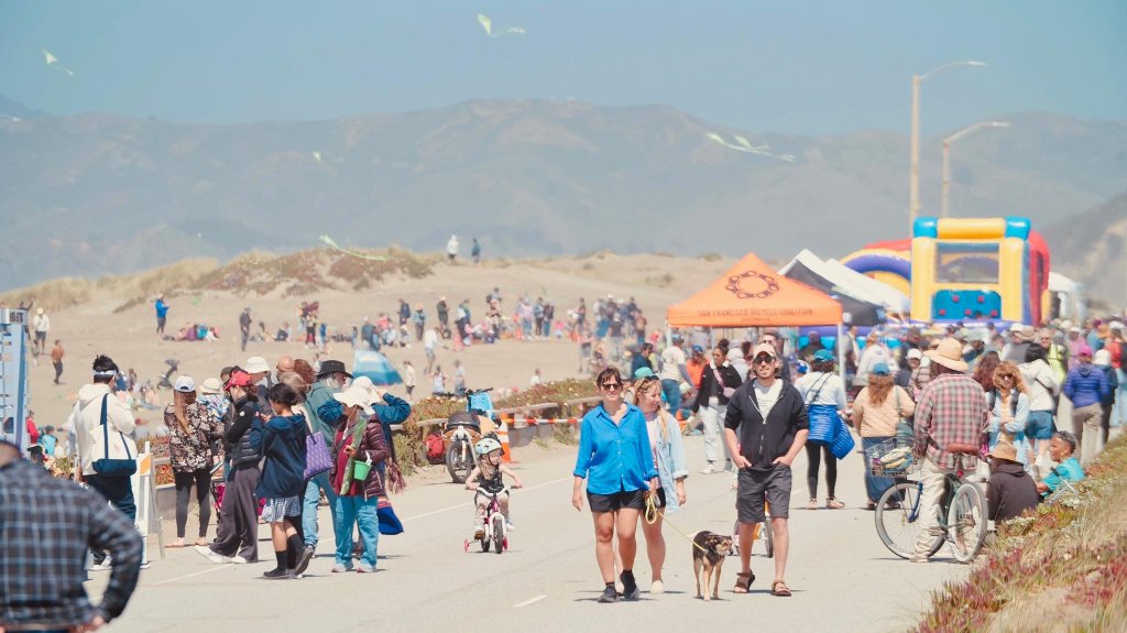
Sunset Dunes One Year Out: They Built It, and People Came
Trump Wants to Slash Federal Funding for Public Transit, Rail (Again)
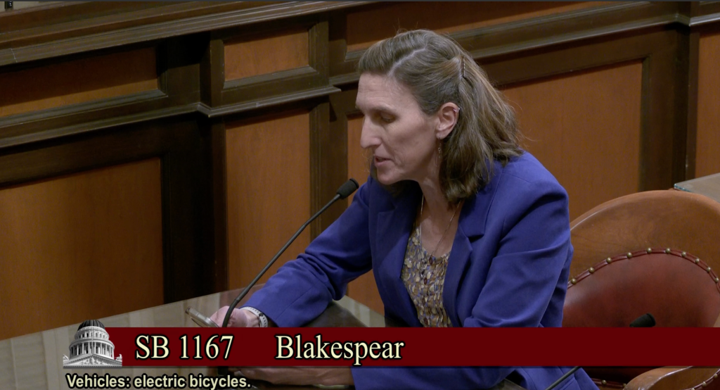
In Year with a Glut of E-Bike Legislation, Blakespear’s Efforts to Define E-Bikes and Limit E-Motos Advances
By updating the laws on what is and isn't an e-bicycle, advocates believe they can make streets safer and improve the industry.
The post In Year with a Glut of E-Bike Legislation, Blakespear’s Efforts to Define E-Bikes and Limit E-Motos Advances appeared first on Streetsblog California.



Comments Are Temporarily Disabled
Streetsblog is in the process of migrating our commenting system. During this transition, commenting is temporarily unavailable.
Once the migration is complete, you will be able to log back in and will have full access to your comment history. We appreciate your patience and look forward to having you back in the conversation soon.