Open Thread: How Would You Do Intersection Markings?
What markings and street constructions cause you the most consternation?
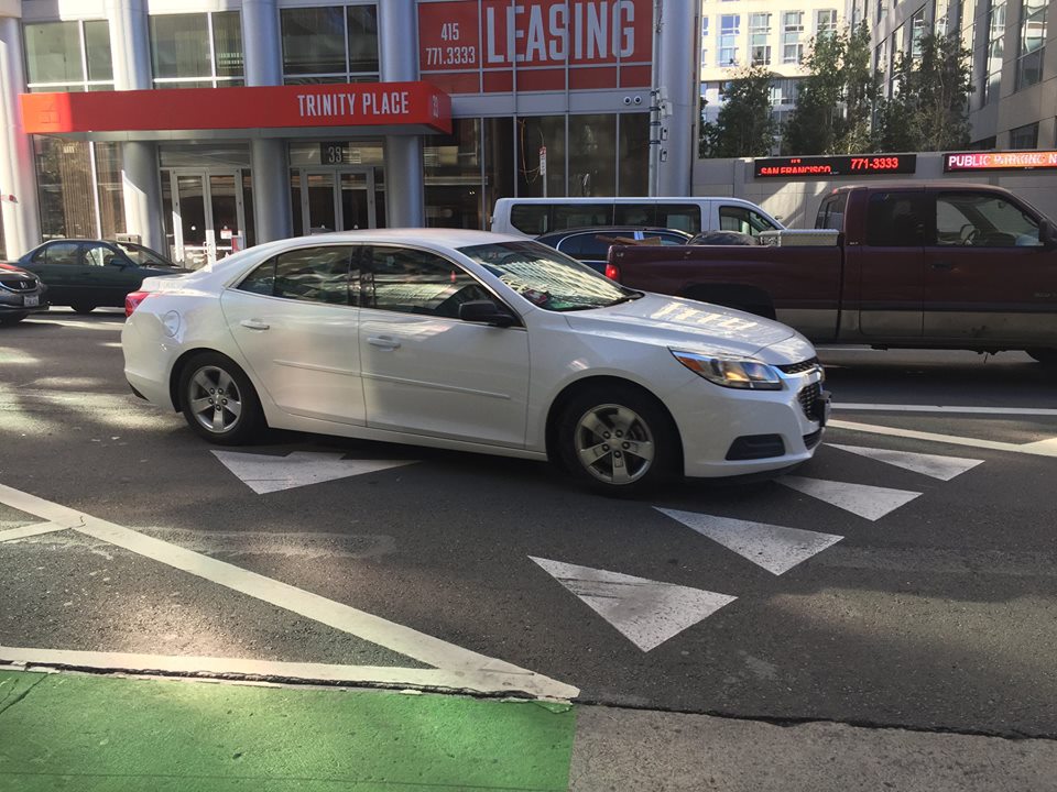
That’s what SFMTA is trying to find out. Michael Sallaberry, from the agency’s Livable Streets division, posted the question on Facebook’s San Francisco Bike Ride Crew page. The example he gave in the post, as seen in the lead image, was a photo of “shark teeth” yield markers at an intersection in SoMa.
From his post:
SFMTA is working on some videos explaining new roadway markings, signs, and signals. Is there anything in particular that you see on the street that is confusing? We’re doing a video on “yield triangles,” for instance, like those in the picture. Anything else you think could use explaining, especially to drivers? We’ll be doing videos for bicyclists and pedestrians later too.
Streetsblog’s initial thought was that Sallaberry definitely picked the right treatment–the infamous mixing zone and its yield triangles–as an example of a marking that confuses people. Our second thought was: if you have to make videos explaining how to read a sign or use an intersection, you’re doing it wrong. Streetsblog tipster Ziggy Tomcich wrote more or less the same thing, a bit less diplomatically, in a comment on the Facebook thread:
Streets should be designed so that it’s instinctively obvious what drivers should do. Making ambiguous intersection markings without any signage, and making a video that nobody will watch, is a dumb f*ck approach to street safety.
At intersections, what to do must be clear to motorists, pedestrians, and cyclists; intersections are where, more often than anywhere else, people die.
That’s the idea behind Dutch-style protected intersections: even if a motorist doesn’t understand the shark teeth or any of the other signs, the concrete on the ground forces them to slow down and make wide turns, maximizing opportunities to spot a cyclist or pedestrian and hit the brakes before a disaster. And if a motorist still doesn’t get it, they bump a protective concrete traffic island instead of hitting a person.
Those concrete islands also keep people from parking in ways that obstruct sightlines and render any signage almost irrelevant. Streetsblog New York’s David Meyer wrote this great piece about those issues–it includes a video of a cyclist going down in a poorly designed mixing zone that will seem familiar to San Franciscans.
This much is clear–cyclists are generally not happy with intersection treatments in SoMa or on the new section of protected bike lane on Valencia. Fully protected intersections are the gold standard, but seem to be off in the future for some reason.
So what can we do in the meantime? Can we improve signs and emulate some of the features of a protected intersection in the short term, such as Portland did in the intersection pictured below, where a planter substitutes for the protective island?
What do you think? Post your thoughts below.
Streetsblog has migrated to a new comment system. New commenters can register directly in the comments section of any article. Returning commenters: your previous comments and display name have been preserved, but you'll need to reclaim your account by clicking "Forgot your password?" on the sign-in form, entering your email, and following the verification link to set a new password — this is required because passwords could not be carried over during the migration. For questions, contact tips@streetsblog.org.

