Eyes on the Station: BART Celebrates 19th Street Modernization
Note: GJEL Accident Attorneys regularly sponsors coverage on Streetsblog San Francisco and Streetsblog California. Unless noted in the story, GJEL Accident Attorneys is not consulted for the content or editorial direction of the sponsored content.
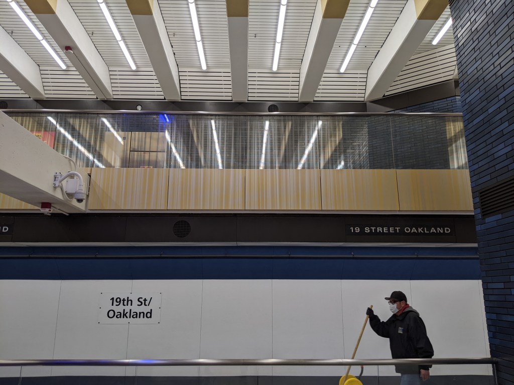
BART officials celebrated the completion of a major makeover of its 19th Street station in Oakland on Saturday. Improvements include new paint, bright-and-modern lighting, and illuminated artwork to help make some of those previously dark corners of the stations seem a little more inviting. From a BART statement:
The upgrades and improvements to the station in the heart of Oakland’s Uptown neighborhood allow BART to expand station capacity, improve access, save energy, reduce fare evasion, and enhance the customer experience. The station is now brightly lit for safety with an open concept, modern look as the project redesigned the concourse to turn three paid areas into one continuous paid area, and eliminated hidden corners by using glass barriers instead of brick.
Streetsblog was given a tour of the new installations by BART’s art program manager Jennifer Easton, who explained that the artwork in the station is intended to evoke the area’s music-and-dance history. The artwork is strategically placed on the stairwells, as seen below:

“Waxed for Dancing,” by Lisa Bank and Hailey Payne Banks, is “stylistically inspired by Sweet’s Ballroom,” a venue that drew famous musicians to the neighborhood. Another stairwell is adorned with Phillip Hua’s “Where do we go from here,” seen below:

Tiles were fixed for the project and new gold paint was added to the ceiling, along with bright white and blue LEDs seemingly everywhere:


Also, the station has brand-new bathrooms:

Streetsblog took a peek inside and they’re tidy, at least for now. In addition, formerly steel railings were replaced with glass:

The glass partitions are also intended to help defeat fare beaters, said Easton. The station will soon be getting higher fare gates that are harder to jump.
Streetsblog found a picture from before to show what the railings used to look like:

Streetsblog found the new station to indeed be more inviting and bright, but there’s some question about the practicality of a decision to replace steel fencing with glass. This is a picture from the opening weekend of the Central subway last month:

Expecting glass to last in the Bay Area, sadly, is a little unrealistic. Additionally, this was a missed opportunity to improve wayfinding in the station. Below is a newly illuminated and polished sign with directions, but it’s also the kind of wayfinding that’s a little too artistic for its own good and is easy to miss:

BART could still do better. Japanese stations, which can be enormous and staggeringly complex, aren’t hard to navigate because of floor markings and clear signs, generally color coded. Here’s an example from New York’s MTA of how BART might still improve things:

This is also something San Francisco got right with the new Central Subway connection at Powell:

Is that Streetsblog nitpicking? Of course. That said, the 19th Street station certainly looks better, especially the staircases. Some more photos below:


Streetsblog has migrated to a new comment system. New commenters can register directly in the comments section of any article. Returning commenters: your previous comments and display name have been preserved, but you'll need to reclaim your account by clicking "Forgot your password?" on the sign-in form, entering your email, and following the verification link to set a new password — this is required because passwords could not be carried over during the migration. For questions, contact tips@streetsblog.org.